Friday, June 18, 2010

Grey with a Pop: a Color Board for June-uary

Despite the fact that we're solidly in the middle of June, 'round these parts we've only gotten a tiny taste of summer. Overall, it's been very wet up here in the Northwest. We got more rain in May than in February. It's definitely made me appreciate the warm, clear days when we have them, few and far between as they are.

Nevertheless, the days are still long, and the combination of mild temperatures, intermittent sun, and plenty of water has made for some very lush landscaping. Hence the inspiration for this color board: defiantly bright blooms popping against a forbidding, storm grey sky.


(Necklace: For Me, For You; Vintage naval wedding photo: Flickr; Polka Dot Pump and Grey Dresses: J Crew; Papillon Top: Mod Cloth; Cake: Artisan Cake Company; Fabric flower: Melbry; Ice cream dishes: Knack Studios; Brooch: Ulani; Flowers: Anna Mara Flowers; Mailbox: Knack Studios)

Saturday, April 17, 2010

Phaedra Paperie's First Letterpress!

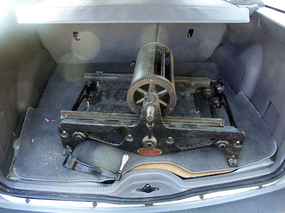
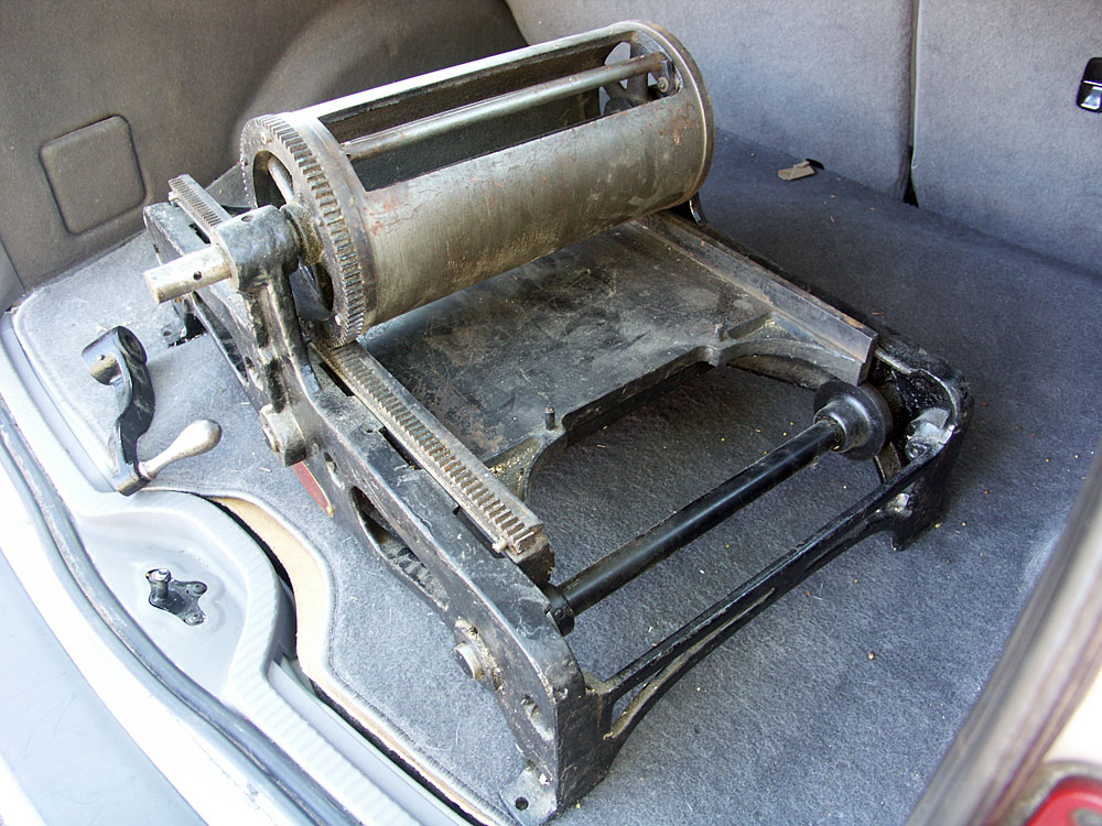
On behalf of Phaedra Paperie, I'm proud to welcome our first letterpress into the studio.


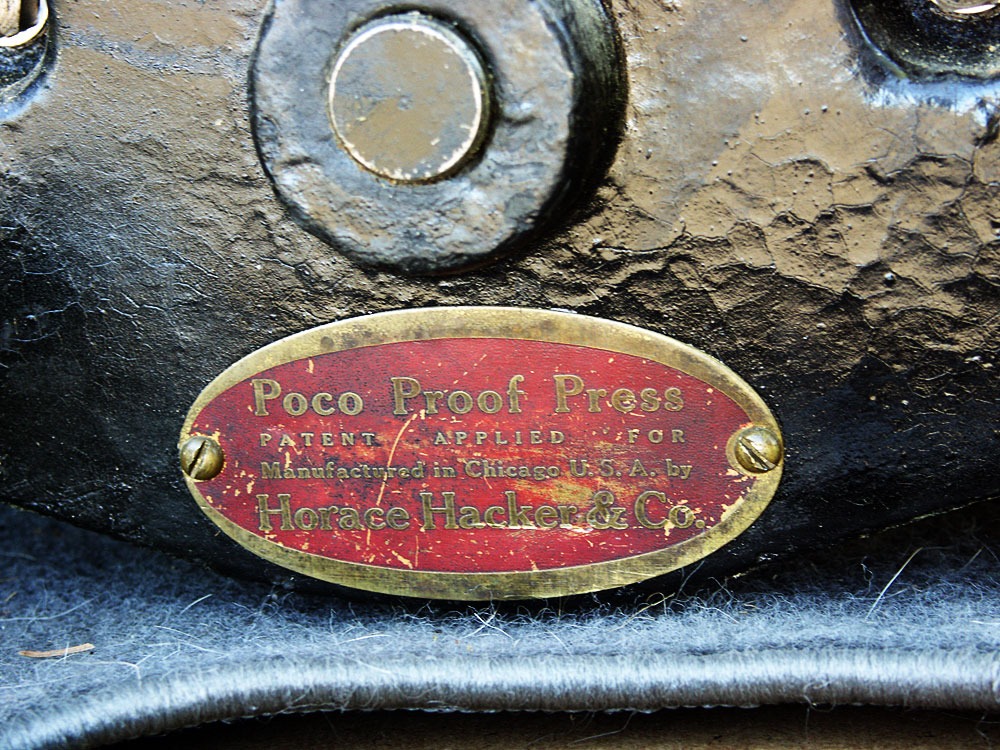
It is an as-yet unnamed Poco #0 Proof Press. Although it needs a little bit of restoration (minor rust and overall crud from storage) it looks to be in pretty good shape and I'm super-excited to clean it up and get printing.

It's hard to find much information on Pocos on the web, as they seem to be rare and somewhat relegated to dusty corners. I do know that this one dates to before 1937, but that's about it so far. (See flyer to the right; worth a closer look.)

They were never intended for tight registration -- literally just for quick proofs to check spelling -- and they lack an integrated inking mechanism, but there are a dedicated few out there who have made these little wonders perform like their inventors never intended. I hope to join their ranks.


Look forward to updates on the press's restoration and first printing trials!

Friday, March 19, 2010

Happy Spring!

Around here, spring has been chomping at the bit for a few weeks already. Longer days and clear skies have made the days warm and the nights crisp. Perfect spring weather. The tulips are about to bloom, daffodils are up, and the trees are blossoming. The air itself smells sweet!

Tomorrow is the official first day of spring. A Saturday, how perfect! So get out there and enjoy the fresh blossoms and blue skies!

(Green Stripe and Daisy Fondant Cake: Vanilla Bake Shop; Filigree Fabric in 'Meadow': Anna Maria Horner; Floral Arrangement with Tulips: Ink & Peat)

Wednesday, February 17, 2010

Screenprinting for the DIY Bride

I'm teaching a small hands-on workshop on silk screening your own wedding invitations, and there's still time to sign up!

Wedding costs can really add up, and invitations are no exception. In this class, you will learn how to use silkscreen printing to make your own hand-printed wedding invitations. Get exactly the invitations you want – at a fraction of the cost!

In the first part of this class, we will discuss materials. What do you need? What can you do without? Which corners can you cut and still get a good final product? And where can you get it all (plus, how much of it do you already have)?

In the second part, each participant will get hands-on experience with the entire printing process. You will leave with a variety of cards and sample invitations, the experience and confidence to start on your own wedding invitations!

I'll be bringing everything we need to start printing. Just bring your crafty self!

Saturday, February 27
12-3pm
Cost: $45.00

Contact the Portland Paper Zone to sign up: (503) 233-2933
1136 South East Grand Avenue
Portland, OR 97214

Monday, January 25, 2010

'Knotical' Invitations Go Both Ways

Our Knotical invitation suite is on the verge of completion, and it's about time. For too long it has existed only as a save the date card, but now it will have invitations, rsvps, and all those extra cards to match, plus a little envelope detail.

When we design invitation suites here at Phaedra, we always make up an imaginary couple. It's much easier to design for someone in particular, even if they're only figments of our own minds. But as you might imagine, we often end up imagining the whole wedding, too!

The Knotical suite was originally inspired by one of those nautical model-knot shadowboxes, little vignettes of regimented skill. But then the sandy dunes and crisp winds of the Oregon coast elbowed their way in, and wouldn't be denied. The result is a design that can go either way: formal or casual.

(Guestbook: Martha Stewart Weddings; Vintage naval wedding photo: Flickr; Favor boxes: Martha Stewart Weddings; Cake: Pink Cake Box; Ropes and ribbons: Brides; Flowers: Martha Stewart Weddings)

The aesthetic of a Naval wedding is a tried and true classic. It's traditional and crisp, with a patriotic flair that can be toned up or down as desired. Though it might be more common among brides and grooms with military ties, a civilian wedding can utilize the same palette and many of the same details: sailor's knots, crisp linens, and polished gold or medal-like accents.


(Landscape: Webshots; Boutonniere: The Knot; Seagulls: Flickr; Tiny white flowers: Capetown Daily Photo; Beach chapel: Flickr; Barefoot bride: Ben Pancoast Photography)

The more casual or beachy take on the Knotical suite relies on the coastal palette. The obvious colors are the sand, sky, and sea, but you might be surprised at how many colors are available in the flowers native to the coastal ranges. Find one or two colors that you love, and use them for a pop of color. Then keep the rest fairly neutral and mellow. Here we chose the yellow-green of dune grass and anemone flowers, but blue-purples are also quite common.

Sunday, January 24, 2010

Sneak Peek!

Just a little sneak peek of something we've been working on in the Phaedra Paperie studio...


It's part of a new card line, which will hopefully be unveiled very soon!

Thursday, June 18, 2009

Joel & Jessica's Desert Wedding

I finished putting together a set of wedding invitations late last week that I'm excited to share. They turned out quite nice -- very simple, but that's exactly what this couple wanted.

invitation front, back and envelopeJoel and Jessica came to me with the photo you see in the shot to the right. They were having what would probably be categorized as a destination wedding, but also a fairly small gathering of mostly family. They didn't want to go over the top on the invitations, like many destination weddings do. They just wanted one piece to announce the basic information, and were going to use the web for everything from RSVPs to directions.

I had paper in mind that I thought might be perfect -- Neenah's Peppered Bronze in a laid finish; the variegated color of the paper makes it look incredibly textured, but it doesn't present problems when it comes to screen printing on it. Jessica liked it, and paired it with French Speckletone envelopes in 'Chocolate.' For ink we simply used the color of the opposite paper, and a clean script for the text.

The result is a compact little treasure, equally comfortable in a frame or on the fridge of its lucky recipients.

To see more images of this invitation, or to browse Phaedra's other designs, visit the Phaedra Paperie website.